Less is more
The uBin Mini has been developed and styled for the style aware, and to look cool in any setting. Simplicity and minimalism are very much key to the design language. A new rim design gives the lid a tighter profile for a sleeker look. We felt recycle awareness has moved on a lot in the last 5 years and that the traditional vibrant colours and shape guided lid inserts would not be essential for the uBin’s smaller brother.
Minimalist Labels – Maximum Outcome
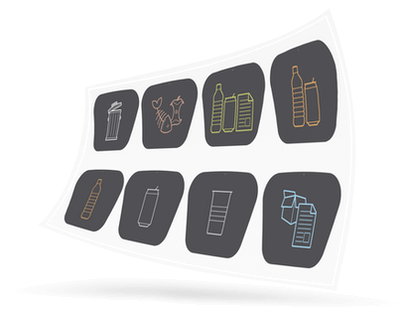
As part of this design update, the labels got a new look as well. Text and WRAP icons have been replaced with a simple and easy to understand graphic icon series. Not only does the new subtle labelling on the uBin Mini look cool, but also thanks to reverse psychology; studies have found people are more inclined to recycle correctly when compared with traditional labelling. It’s all down to psychological effects known as ‘reactance’ and ‘paradoxical Intervention‘; phenomenon where some people feel the urge to defy when they feel pressured to accept a certain view or attitude. By creating a more relaxed, subtle, almost ‘shy’ instruction; the user is more likely to go out of their way to ‘help’ and put the right waste into the right bin.

